What Makes a Good Motion Graphic? Design Tips for Non-Designers
Not a designer? Learn the simple design principles that make motion graphics look professional.
Vela Team
Published · May 27, 2026
You Do Not Need a Design Degree
A few basic principles are all you need. Follow these and your videos will look 10x better than most content out there.
1. Keep It Simple
The biggest mistake beginners make is trying to do too much. Too many colors, too many fonts, too many animations at once. Pick one message. Use two colors. Use one or two fonts. Let each element breathe.
2. Use Consistent Colors
Pick a color palette and stick with it. Usually 2 to 3 colors is enough — a primary, a secondary, and an accent. Use your brand colors if you have them.
3. Make Text Readable
Use large, bold fonts. Sans-serif fonts are easier to read on screen. Make sure text contrasts with the background. Test on a phone screen — if you cannot read it there, it is too small.
4. Use Smooth Transitions
Avoid hard cuts between elements. Use fades, slides, and smooth transitions. They feel professional. Hard cuts feel jarring unless they are intentional.
5. Match the Mood
Your animation style should match the content mood. Fun brand = bouncy animations. Tech brand = smooth, precise movements. Luxury brand = slow, elegant transitions.
How it works
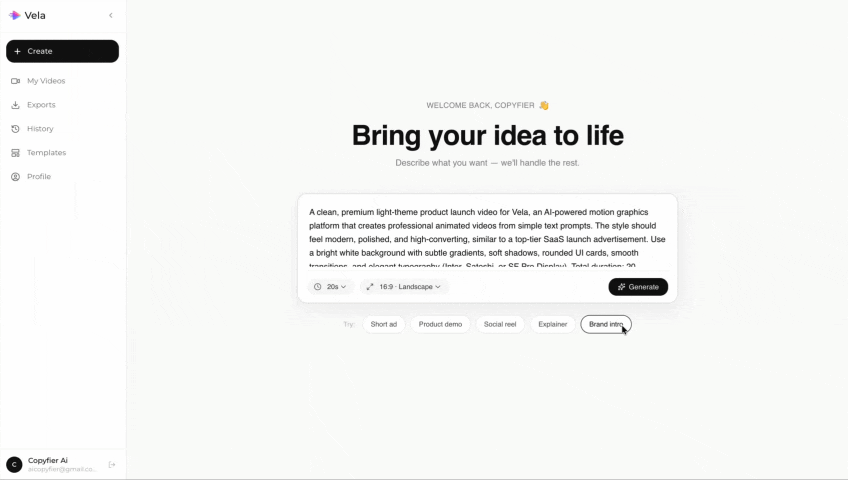
Type what you want. Vela creates the motion graphic. Refine by chatting.
Made with Vela
SaaS Launch
Map Animation
Explainer